
Design Handoff With AI: Why I Stopped Handing Off at All
My Figma file is now the brief Claude builds from. How design handoff with AI works for me, step by step, what I never delegate, and when to keep a handoff.
Design handoff with AI, in my work, no longer means sending a Figma file to a developer and waiting. It means the Figma file becomes the brief for Claude, which reads my frames through the Figma MCP and builds the real product: a SwiftUI app on my phone or a live website. I still design every important screen. I just do not stop at the handoff anymore. I keep going until there is a link you can tap. The practical change is bigger than the tools: I design fewer frames, I describe the motion in words instead of drawing forty in-between states, and I change the design halfway through the build when it feels wrong in my hand. Below is the exact process, what I hand to the AI, what I never hand over, and where this approach does not fit a team.
What design handoff used to mean for me
For most of my 12+ years as a product designer, my job ended at the handoff. Polish the screens, write the specs, redline the spacing, send the file, then wait to see something I could actually use. The detail that made a product memorable was usually the first thing cut from the sprint: ship it static, add the animation later. Later rarely came.
That started to change at ViewStats, the creator platform built by the team behind MrBeast. My role grew from Lead Product Designer into design engineer. I worked in the codebase with Cursor, Claude Code, React, TypeScript and GitHub, designed and prototyped, built React components, opened pull requests and reviewed implementation. Iteration cycles got dramatically shorter. The full story is in the ViewStats case study, and I explain the role itself in what a design engineer is in software.
My experiments pushed it further. Each one on my AI design experiments page is a working build, not a mockup, and none of them had a classic handoff.
Old handoff vs design handoff with AI
| Step | Classic handoff to a developer | My handoff with AI today |
|---|---|---|
| What Figma holds | Every screen and every state, as the deliverable | The key moments only, as the brief |
| Motion | A prototype or a spec page, often cut later | Described in words, built in the same evening |
| Visual effects (glass, blur, shadows) | "The dev couldn't do the blur" | Claude rebuilds them from the exact Figma values |
| Changing the design | A new ticket, a new sprint | Change it mid-build when it feels wrong on the device |
| Feedback loop | Weeks until something is tappable | Minutes for a first build, an evening to make it feel right |
| Where it ends | A file in someone else's queue | A live link or an app on my phone |
My design handoff with AI, step by step
1. Collect the world before opening Figma
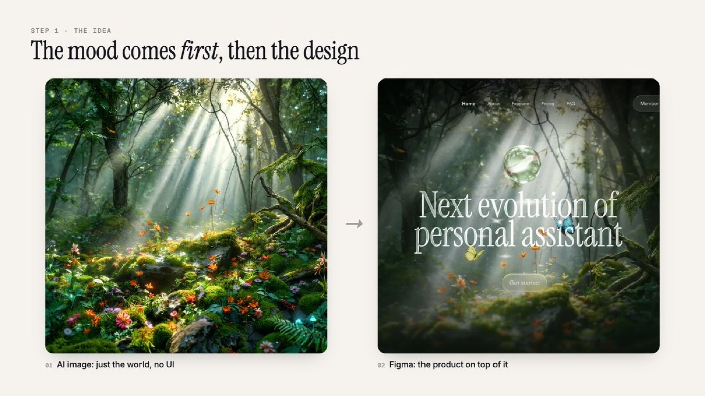
I start by collecting from three places: Dribbble and Behance for the feeling, real products and Mobbin for how things should work, and AI images for the world the product lives in. That last one changed my work the most. For Hywith, a forest landing page for an AI assistant, I generated the forest first, with light rays, moss and small flowers, and no UI at all. Then I designed the product on top of it in Figma. When the world exists first, the interface has somewhere to live and stops looking like every other template.
2. Design two moments, not every state
In Figma I design the start and the end. A loot box app I built is two frames: the closed box, and the reward after it opens. That is the whole spec. Everything in between (the charge, the burst, the card spinning out) I describe in words. Two rules I do not break: frames at the real device size, so nothing gets guessed or stretched, and real effects like glass, blur and shadows, so Claude rebuilds them from the exact values.

3. Give Claude the frames, and talk like you would to a developer friend
Through the Figma MCP server, Claude reads my frames directly: layout, colors, fonts, images, effects. I paste the frame links and describe how it should feel. I always ask for the real build, SwiftUI for apps or a live website, never a prototype. This is close to what Figma itself is now doing with code layers, which I covered in Figma code layers reading your prototype.
4. Let the design change halfway through
This is the part I did not expect. On the loot box, the Figma frame said "swipe up to open". Once it was on my phone, swiping felt cheap. So I asked for hold instead. Now a glass ball appears under your finger, fills while you hold, dives into the box, and the card bursts out. In the handoff days that idea would have waited in a ticket. Now I can feel it the same evening and change it.
5. Design the wow moment first
Every experiment I ship has one moment people remember: water pouring into a glass in Pulse Health, a native iOS app with a real water simulation, gummy bears pouring into a bag on a live scale, a character whose eyes follow your cursor in Jane Noah, a music artist page. I design that moment before anything else, and the rest of the screens support it. When building was expensive, that moment was the first thing cut. Now motion is one of the cheaper parts of the product, so it gets to be the reason people stop scrolling.
6. Spend the evening on details, then test on real devices
The first build takes minutes. Making it feel right takes the evening. I use it like a user, write down everything that bugs me and fix it one message at a time. Real messages from my chats look like "the bears aren't falling right". Then I test on real devices, because previews lie. One landing page felt laggy while every tool said it was fine. The cause was blur effects on buttons sitting over a moving video. Static frosted fills fixed it. The fix was tiny; finding it was not.
What I never hand to the AI
There is no magic prompt. People ask me for it after every build, and the honest answer is a proper design first, a clear idea of how every piece should behave before I open the chat, and a lot of small, boring fixes. Skip the thinking and you get the same generic page everyone else gets.
So I keep these: the choice of what the product is for, the one moment worth building around, the call that a gesture feels cheap, and noticing what is off on a real screen. The AI is fast. The judgment is still mine, and I think it should stay with the designer. That is the same argument I make in what AI replaced in my work as a product designer.
When a classic handoff still makes sense
I would not tell every team to drop handoff tomorrow. This approach fits experiments, new products, landing pages and small teams where one designer can own a surface end to end. In a large product with a platform team, security reviews and shared code ownership, a designer opening pull requests still needs engineers to review them, the way it worked at ViewStats. The handoff does not disappear there. It moves: from a static file to a working branch that engineers can read, test and merge. If you want to start that move, my guide on how to become a design engineer begins with one pull request.
FAQ
What is design handoff?
Design handoff is the moment a designer passes finished designs, specs and assets to developers to build. Traditionally that means a Figma file with redlines, states and annotations.
How does design handoff work with AI?
With tools like the Figma MCP, an AI coding assistant such as Claude reads the Figma frames directly and writes the code. The designer gives the frames plus a description of behavior and motion, then reviews and refines the running build.
Do designers still need Figma if AI writes the code?
In my work, yes. Figma is where I think, compare versions and set the exact layout and effects. It stopped being the deliverable and became the brief the AI builds from and gets checked against.
Will developers still review AI built designs?
For products with real users, they should. In a team, the designer's branch still goes through code review. AI shortens the path from design to working code. It does not remove engineering ownership.
If you want a product designer who designs the moment and keeps going until it is live, work with me as your product designer.
hello@ayoubka.com
If you have a web or mobile app idea in mind or you need some advice about product design, feel free to get in touch ✉️