
Astryx Design System: Meta Built It for AI Agents. Now What?
Meta's Astryx design system is trending on GitHub: 150+ components, a CLI agents read first, and motion inside components. What it changes for designers.
The Astryx design system is Meta's open source React component library, built so that people and AI coding agents use the same components, docs and command line tool. It grew inside Meta for eight years, powers more than 13,000 internal apps, and ships 150+ accessible components, seven themes and a CLI that agents call instead of guessing. It went public in beta in June 2026, shipped version 0.7.11 on November 7, and sat second on GitHub's trending page the morning I wrote this, November 10. My verdict as a product designer who builds with Claude every day: Astryx is the clearest public answer yet to a question every design team now has. If agents write most of the UI code, the design system has to become something an agent can read, search and copy well. That is a design job, not only an engineering one.
Below: what Astryx actually is, what it changes for product designers, where the hype runs ahead of the beta, and how I would use the ideas in it even if I never install it.
What the Astryx design system actually is
Strip the launch language away and Astryx is three things packed together. First, a React 19 component library with 150+ accessible components, styled internally with StyleX but usable with Tailwind, CSS modules or plain CSS on top. Second, a theme layer: a theme is a set of CSS custom property overrides at the token level (color, typography, radius, motion), and seven ready-made themes ship with it, from neutral to y2k. Third, a CLI that the team describes as the real source of truth. In their own blog post on the CLI, they say the docs site is a consumer of the CLI, not the other way around.
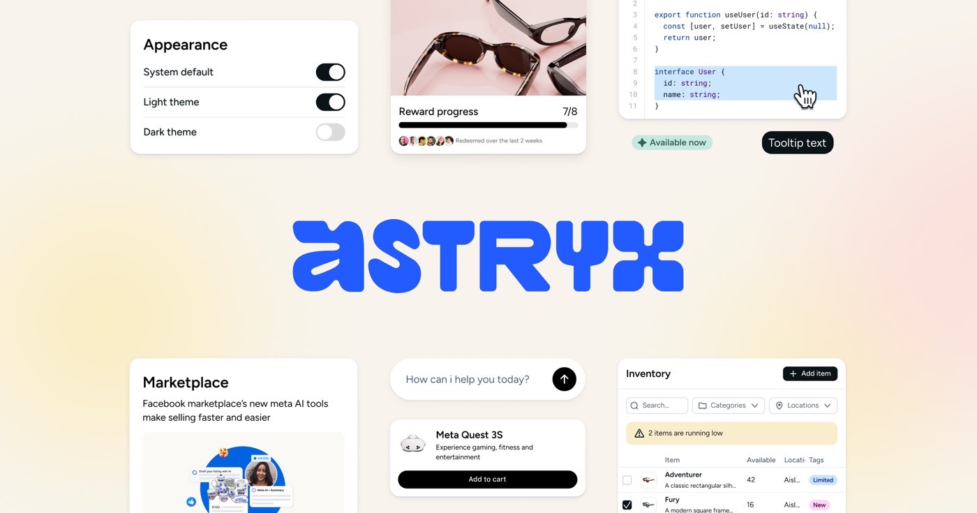
That last part is what makes it news. Most design systems were written for humans: a docs site, a Figma library, a Storybook. Astryx is written for an agent in a terminal first. The CLI prints component props and examples, searches across components, hooks, docs and templates at once, and has a command called astryx build that takes a plain language prompt ("a settings page with a danger zone") and returns the closest page template, the right smaller blocks and the components to fill the gaps. Every command answers in JSON with stable error codes, so an agent can rely on it.
The source is on Meta's Astryx repository on GitHub under an MIT license, with docs, Storybook and a sandbox on the official Astryx site.
What shipped this week, and why it matters for motion
The November 7 release, v0.7.11, is a small point release, but it shows how this team thinks. The headline change is about motion. On a touch device, a Popover now grows out of its trigger, wide before tall, and shrinks back into it on close. In the Storybook theme the growth uses the duration step nearest to iOS's 206 ms. With reduced motion turned on, it cross-fades with opacity only, in 200 ms or less. A tap that lands while the popover is still growing is ignored. A mouse keeps the old entrance.
Read that again as a motion designer. Someone specified the direction of growth, the anchor edge, the interruption behavior, the reduced motion fallback and which input gets which animation. That is the level of detail I usually have to fight for in a handoff, and here it lives inside the component, so every agent that drops a Popover gets it for free. The same release added hover delays to dropdown submenus (150 ms to open, 200 ms to hide by default) and a time zone prop for timestamps. Boring, correct, the kind of thing generated UI always gets wrong.
| Question | A classic design system | Astryx's approach |
|---|---|---|
| Who reads the docs first? | Designers and developers on a docs site | An agent through the CLI; the site is generated from the same source |
| How do you find the right pattern? | Browse, search by component name | Describe what you are building; astryx build returns a page, blocks and components |
| How do you make it look like your brand? | Fork, wrap or fight the defaults | Override tokens as CSS custom properties, or eject one component's source |
| Where does motion live? | A spec page and a hope | Inside the component, tied to theme duration and easing tokens |
| How are decisions tested? | Design review and taste | "Vibe tests": the same prompts run against Astryx, Tailwind, shadcn and raw HTML, scored by a judge agent |
| Role of the Figma library | The spec and the handoff | A sketchpad, kept in sync by a scheduled agent connected to the Figma MCP |
What it changes for product designers
The most honest line in the whole project is in their August post about the Figma library. The team wrote that internally they saw a 95% drop in their weekly Figma library insertion rate, and that most designers around them now design through code, not canvas. They still built a Figma library, because Figma remains the fastest place for rapid exploration and visual assets, but they stopped using it for specs or handoff. A scheduled agent they call the Figma Librarian, connected to the Figma MCP, rebuilds and maintains the library on every dot release.
I recognize that shift because I lived a version of it. At ViewStats, the creator platform built by the team behind MrBeast, I designed a design system that had to cover web, mobile, marketing pages and a Chrome extension: typography, color, navigation, data visualization, tables, forms, empty states, variables and tokens. Later I moved from handing off files to working in the codebase with Cursor and Claude Code, building React components and opening pull requests myself. The ViewStats case study has the full story, and I wrote about the system itself in one design system for web, app and extension.
Astryx points at three changes for designers like me:
- Examples become the design work. Their CLI post is titled, roughly, that AI is a copycat so they gave it good examples to copy. Early templates were full of plain divs and the agents copied them. They wrote a grading rubric and had designers rebuild the templates, and the output improved. The highest leverage design artifact is no longer the mockup. It is the example an agent will imitate a thousand times.
- Tokens carry the brand, components carry the behavior. If a theme is just custom properties for color, type, radius and motion, then brand work is token work. That is good news for designers who think in systems and bad news for anyone whose value was pixel-pushing components that already exist.
- Taste gets measured. Their vibe tests use personas, prompts that describe the experience ("build an FAQ page where the user opens each question") rather than the component, and a separate judge agent. You can argue with the method, but it is a real attempt to test design decisions instead of asserting them.
Hype vs reality
Now the part the trending page does not show.
It is a beta. The version number starts with zero and the release notes include migration codemods for a reason. Chart components are only on a canary tag with no stable release yet. If you adopt it for a product that has to be stable next quarter, plan for upgrades.
It is React only. React 19 or later, web only. My own work spans SwiftUI and Metal shaders on iOS, WebGL and three.js on the web. None of that is covered. For a native app, Astryx is a reference for how to structure guidance, not a library you can use.
The numbers are Meta's own. The 13,000 apps, the 95% drop in Figma insertions and the vibe test results are self-reported. I take them as an honest signal from a team that writes in detail, not as industry data.
Agents still make convincing, mediocre screens. The team says it plainly in the invite to their November 12 meetup in San Francisco: "looking convincing does not guarantee a good experience." A design system raises the floor. It does not decide what the product should do, which flow to cut, or where the one moment of delight should go. That is still the product designer's call.
Your look can drift toward everyone else's. If thousands of teams point agents at the same templates, a lot of internal tools will look alike. Seven themes and token overrides help, but distinctive products still need someone to push past the default.

Where it fits in my workflow
I build most of my experiments with Figma as the brief and Claude doing the code through the Figma MCP. The pattern Astryx formalizes is the one I already rely on: the model is only as good as the reference you put in front of it. When I built the Payno card freeze interaction, where you tap the ice three times to shatter it, the result depended on how precisely I described the moment, not on a magic prompt. The full set of builds lives on my AI design experiments page.
So here is how I would use Astryx this month:
- For a new React internal tool or dashboard: I would try it as the base and spend my design time on tokens, two or three signature moments and the empty states, not on rebuilding buttons.
- For a product with a strong brand: I would read its conventions, its CLI design and its template rubric, then copy the ideas into our own system: one source of truth that agents read, examples at three sizes (page, block, component), motion specified inside components.
- For a native iOS app: I would skip the library and borrow only the thinking.
The idea I am taking from this release is simple. I used to write motion specs for engineers. Now the most valuable motion spec is the one written into the component, where an agent cannot ignore it. If you are moving in that direction, my guides on what a design engineer does and how to become a design engineer cover the skills, and Figma code layers reading your prototype shows the same shift from the Figma side.
FAQ
What is the Astryx design system?
Astryx is an open source design system from Meta, built on React 19 and StyleX, with 150+ accessible components, seven themes, templates and a CLI. Meta says it grew internally over eight years and powers 13,000+ apps. It is MIT licensed and in beta.
Is Astryx free to use?
Yes. The code is on GitHub under the MIT license, and the packages install from npm. There is no paid tier mentioned on the official site.
Does Astryx work with Figma?
There is an Astryx Figma library, but the team treats it as a sketchpad, not a spec. It is maintained by a scheduled agent connected to the Figma MCP that updates the library on every dot release.
Can AI agents like Claude Code or Cursor use Astryx?
That is the main point of it. The CLI gives agents docs, examples and an astryx build command that maps a plain language request to templates, blocks and components, with JSON output an agent can parse.
Will agent-ready design systems replace product designers?
They replace the repetitive part: rebuilding standard components and redlining them. They do not replace deciding what to build, writing the examples agents copy, or designing the moments that make a product feel alive. If anything, those parts are worth more now.
If your team is setting up a design system that people and agents both have to use, or you want a product designer who also designs the motion and ships the code, work with me as your product designer. You can also browse my product design work first.

hello@ayoubka.com
If you have a web or mobile app idea in mind or you need some advice about product design, feel free to get in touch ✉️