
Apple HomeView Widgets Are Live. What Designers Should Check
Apple HomeView went on sale Nov 13 and shows your iPhone's small widgets to the whole household. What Apple published, the risks, and a 6-step check.
Apple HomeView went on sale on November 13, 2026, and it quietly gave every iOS app a new screen. Apple HomeView widgets come straight from the iPhone: per Apple's Human Interface Guidelines, people can place small system family widgets from their connected iPhone or iPad on the HomeView Home Screen and on the shared Modular face, and you do not ship a separate HomeView app for that. So if your app already has a small widget, it can now sit on a kitchen counter, seen from across the room by a whole household. My verdict: this is not a new platform to design for. It is a new distance, a new audience and a new privacy problem for a widget you already made. Most teams will not notice until a user posts a screenshot of their widget looking wrong on a wall.
Below: what Apple actually published, what it changes for product designers, the hype vs reality, and the checklist I would run on any widget this week.
What Apple HomeView actually is
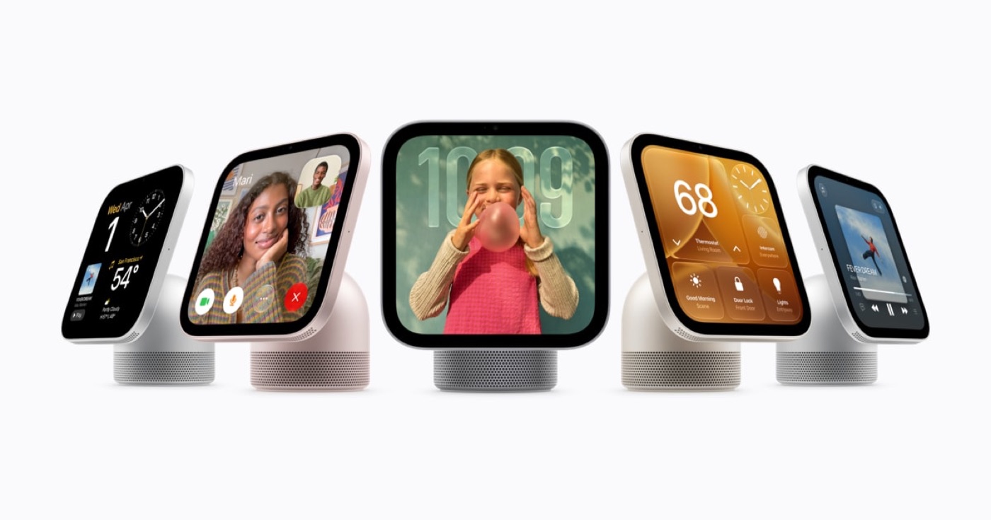
HomeView is a 7-inch Liquid Retina display, sold as a tabletop model on a speaker base or as a wall-mounted model, both at $299 in the US. Apple's availability announcement lists Australia, Canada, India, New Zealand, Singapore, the UK and the US, and says it is not sold in the European Union because Siri AI is not available in iOS there. It recognizes up to six people by face, and it only shows personal content like Messages, Calendar and Reminders to the person it recognized.
The original October 13 announcement adds two details designers should read twice. First, each recognized person gets their own personalized Home Screen with apps and widgets. Second, brightness runs from 500 nits down to 0.3 nits, and the interface shows simpler information from across the room and more detail up close. There are also faces: Photos, Flow, Snoopy, Home Modular and Home Camera.
The part that matters for app teams is in the Widgets page of the Human Interface Guidelines, which Apple updated on October 13 with HomeView guidance:
- Widgets on HomeView are from the small system family and share the appearance of iPhone widgets.
- A person picks widgets that come with HomeView (like Weather or World Clock) or widgets from their own connected iPhone or iPad.
- The Modular face holds up to four widgets, which can come from different household members' iPhones. There is one Modular face per household. Apple's own example: if someone puts a Calendar widget there, that person's calendar appears for everyone.
- On the Modular face, widgets are scaled up with the background removed, and below an ambient light threshold the system renders them in a monochromatic red tint (the same Night Mode treatment as StandBy).
- On the Home Screen, people choose light, dark, clear or tinted appearances. Clear desaturates the widget and adds translucency and the Liquid Glass material.
What Apple HomeView widgets change for product designers
Three things change, and none of them are about pixels.
The distance changes. A phone widget is read at arm's length, a few times a day, by its owner. A HomeView widget is read from the sink, the sofa or the hallway. Apple itself designed the system UI to simplify across the room. Your widget does not get that for free: the small family is a fixed size, so what you put in it has to survive being read from two meters away. One number, one label, one state. If your small widget is a tiny dashboard, it fails here.
The audience changes. This is the one I would lose sleep over. On the Modular face, a widget from one person's iPhone is shown to everyone in the room. Your widget was designed with a single reader in mind. Now a partner, a child, a guest or a cleaner can see it. A budget widget showing a balance, a health widget showing a medication, a period tracker, a dating app streak: all fine on a phone in a pocket, all a problem on a kitchen wall. Apple's own Calendar example makes the point for you.
The light changes. The red Night Mode tint and the removed background mean your color carries no meaning on the Modular face at night. If red means "overdue" and green means "fine" in your widget, both become the same red. State has to live in shape, position and words.
Hype vs reality
The hype version: "every iOS app is now a HomeView app." The reality is narrower.
| What people say | What Apple actually published |
|---|---|
| Your iPhone apps run on HomeView | Widgets from the small system family appear. Apps listed are Apple's own plus compatible third-party audio and video apps, and some need a paired iPhone nearby. |
| You need a HomeView design | No separate HomeView design is asked for. Widgets share the iPhone widget appearance. |
| Medium and large widgets will show | The HIG table lists only System small for HomeView. |
| It is private because it uses Face ID style recognition | Personal app content is gated by face recognition, but the Modular face is shared by the household. |
| Siri AI makes it smart everywhere | Siri AI is in beta, English only, not in the EU, with daily limits on some features. |
What is missing: there is no HomeView simulator mentioned in the guidance I read, and I could not find a HomeView design kit from Apple. So you will test on the real device or reason from StandBy, which shares the scaled-up, background-removed, red-tinted treatment. My honest take is that StandBy is the best proxy you have today, and if your widget already works in StandBy and CarPlay, you are most of the way there.
Also be clear-eyed about reach. HomeView launched in seven countries at $299. For most apps, this week is a quality check, not a roadmap change.
Where it fits in my workflow
I have taken native apps all the way to the App Store, with widgets and Live Activities, so this lands on work I already own. The way I design a widget now is the same way I designed the mobile app at ViewStats, the creator platform for MrBeast's team: for the in-between moment. Creators opened it between uploads, shoots and edits. A widget is the purest version of that moment. People rarely want more information. They want clarity, and a widget on a wall makes that rule brutal.
The other lesson from that project carries over too. Our Chrome extension grew because it put insights inside YouTube instead of asking creators to switch tabs. A widget on HomeView is the same move: the product shows up where the person already is. That is a real chance, as long as it is useful in two seconds.
For the clear appearance, I build and test in SwiftUI, not in a static frame. Liquid Glass changes contrast depending on what sits behind it, and you only see the real result running. That is why my Pulse Health experiment with Liquid Glass and a water simulation is a live build, not a mockup. I wrote about the same "design it where it renders" habit in dashboard UX best practices, and it applies even more to a 7-inch screen read from across a kitchen.
My process for a HomeView pass: design the small widget in Figma at real size, then hand the frame to Claude through the Figma MCP to get the SwiftUI version, then check it in every rendering mode in code. I explain that full loop in my AI design workflow from idea to App Store.
The checklist I would run this week
- Two-meter read. Print or display your small widget at real size and read it from across the room. One primary value should win.
- Shared-room test. Ask: would the owner be fine if their whole household saw this? If not, add a redacted state or a widget configuration that hides sensitive values.
- Night Mode test. Turn the widget monochrome red. Can you still tell states apart without color?
- Background removed. Does it still read when your background color or gradient disappears?
- Clear and tinted. Check legibility on Liquid Glass and with a random tint.
- Deep link sanity. A tap on a shared screen should not open private content for the wrong person.
FAQ
Do Apple HomeView widgets need a separate app?
Not according to Apple's HIG. HomeView shows small system family widgets that come with HomeView or from a person's connected iPhone or iPad, and they share the iPhone widget appearance.
Which widget sizes work on Apple HomeView?
Apple's HIG says widgets on HomeView are from the small system family, on both the Home Screen and the Modular face. Medium and large widgets are not listed for HomeView, so the small one is the one to polish.
Can other people see my widget on HomeView?
Yes, on the Modular face. Apple says it can hold up to four widgets from different household members' iPhones and there is one per household. Design for a shared audience.
Is Apple HomeView available in Europe or Morocco?
Not at launch. Apple lists Australia, Canada, India, New Zealand, Singapore, the UK and the US, and says it is not sold in the EU because Siri AI is not available in iOS there.
How do I test a widget for HomeView without the device?
StandBy on iPhone is the closest proxy: same scaled-up, background-removed look and red low-light tint. Test every rendering mode in code, not in a static mockup.
If you have a widget or a Live Activity that needs a real design pass for HomeView, StandBy and CarPlay, I do exactly that work, design and SwiftUI. Work with me as your product designer, or browse my AI design experiments to see what I ship.
hello@ayoubka.com
If you have a web or mobile app idea in mind or you need some advice about product design, feel free to get in touch ✉️