
AI Motion Design in Real Interfaces: 7 Rules From My Builds
AI video can animate your interface, if it never sees your text. 7 rules from my Kling builds: plates, drift checks, seamless loops and when code wins.
AI motion design, for me, means using a video model like Kling to paint the moving world of an interface (a suitcase opening, a jellyfish swimming between sections, clouds drifting over a landing page) while the text, buttons and interaction stay real code on top. It works when the video model gets a clean Figma frame as its first frame and another as its last, never sees your text, and is checked frame by frame against the design. It fails when you let it decide the layout. That split is the most useful thing I have learned taking AI experiments from idea to design to code: the video model paints, Claude builds, and the Figma frame is the reference both get checked against. Below are the rules I now follow, the failures that taught them, and where code still beats any model.
Why AI motion design changed my role
I have been a product designer for more than 12 years. For most of that time, motion lived in a prototype or a spec, and someone else decided how much of it survived into the product. Today I take my experiments end to end: idea, Figma, code with Claude through the Figma MCP, motion with AI video, sound effects, and for some builds, the App Store. I wrote the full chain in my AI design workflow from idea to App Store. Motion is the step that changed the most, because a video model can now produce a cinematic scene that I could never have animated by hand in the time I give an experiment.
But a beautiful clip is not an interface. AI video, as I put it on X, looks amazing and has no idea where your design ends. It zooms your layout, melts your letters and adds things nobody asked for. Everything below is about closing that gap.
The seven rules I follow for AI motion design in UI
These come from real builds on my AI design experiments page, and I first wrote them up in my "Is Figma dead?" post on X.
1. The model never sees my text
Before anything goes to a video model, I clone the Figma frame and hide every title, button and label. That clean frame is the plate, and it is the only thing the model gets. Video models are bad at text: letters wobble, melt or get re-spelled. So the model only paints the world, and the words go back on top as real code, sharp at any size. On Traveme, a travel app onboarding, even the headline that curves around the suitcase is not from the video. Claude renders it along the exact curve from Figma and lays it over every frame.
2. Figma frame in, Figma frame out
Each screen is a plate. Screen one is the first frame, screen two is the last, and the model only invents the motion in between. Going back is not the video in reverse, though. Reversed, the suitcase lid closing looked wrong, so the back moves got their own clips. Reverse playback is only for when someone changes their mind mid-swipe.
3. Check every clip for drift
The first model I used re-rendered every clip about 2% bigger and shifted a few pixels. You do not see it watching the clip. You see it the moment the video starts on top of the still, because the whole design jumps. Now I check every clip the same way: first video frame over the Figma plate at 50% opacity. If the handle shows twice, the model moved my design.

Claude wrote a small script that measured the zoom and offset and scaled every frame back. It worked, but the clips also had uneven pacing and dead frames at the start, so I switched models. Kling 3.0 held my exact frames with no drift, so it does these now.
4. Loops with no seam use the same first and last frame
For anything that should keep moving, I give the model the same image as first and last frame. On Ocean Wave, the jellyfish landing page, the jellyfish swims and returns to the exact same pose, so there is no seam to hide. It sits on pure black on purpose: the page keys the black out and the jellyfish floats on the ocean like the cutout in Figma. Two failures taught me the limits. The ocean background froze when I locked start and end, so it was remade with only a start frame. And a back-and-forth idle loop on Traveme slowed at both ends, so it looked like it stopped and restarted. Idles are now ten second forward loops with even pacing.
5. Five clips have to feel like one film
Separate clips stitched together feel like separate clips. My actual message to Claude was that the transitions were too long and not fluid. What fixed it: a few frames of blend at every handoff, slow parts flattened into one even move, and clips encoded so you can drag through them with a finger, forward and back. Now the Traveme onboarding scrubs like one film. I used the same scroll-scrubbing idea on a perfume page, explained in scroll animation examples from a perfume ad that rewinds.
6. Green screen, but for websites
For a wearable landing page, a helmet had to come apart on scroll on top of a real grid and real text. A full video background would have covered the layout. So the plates went on flat green, helmet on as the first frame and helmet off as the last. A small keying script cuts the subject out frame by frame, and the page puts it on top of the real layout. Scroll scrubs the clip.
7. One test clip, then fix the rest in code
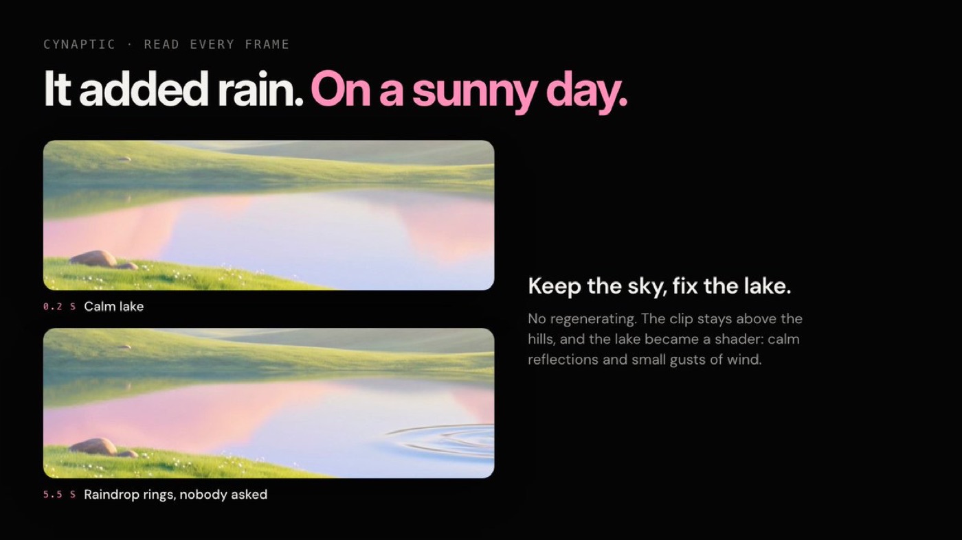
On Cynaptic, a card landing page with grass in the wind, I wanted the sky and the lake to move. The clouds came out beautiful. A few seconds in, the lake started growing raindrop rings. On a sunny day. I did not regenerate. The clip stays above the hills, and the lake became a shader with calm reflections, a slow swell and small gusts of wind.
Where AI video wins and where code wins
After these builds, this is how I split the work. It is not a rule of the universe, it is what held up in my projects.
| Part of the interface | AI video (Kling, via Higgsfield) | Code (shader, physics, CSS, SwiftUI) |
|---|---|---|
| Text, buttons, labels | Never. Letters melt and get re-spelled | Always. Sharp, accessible, translatable |
| Cinematic transitions between two designed screens | Strong, with first and last frame locked | Expensive to hand-animate at the same richness |
| Idle loops (a creature, a floating object) | Good, same frame at start and end | Fine for simple shapes |
| Water, grass, wind, large ambient surfaces | Risky. Models add weather and detail you did not ask for | Better. A shader is controllable and costs nothing per render |
| Anything the user touches or drags | Only as a scrubbed clip | Physics and real interaction, like the ice you tap to break |
| Going backwards | Needs its own clip; reversed video often looks wrong | Reverses naturally |
The tools I name here are Higgsfield, where I run Kling and other video models, and Claude for the code. Sound is the next layer on top of motion, and I wrote about why my builds have it in UI sound design, the layer most product designers skip.
What this means for the future of designers
I do not think AI motion design removes the motion designer. It removes the hours between knowing what the moment should feel like and seeing it. What it cannot do is notice that the lake should not have rain, that the reverse looks wrong, or that a 2% drift will make the screen jump. That noticing is design judgment, and it is the part that stays with us. I made a similar argument for the whole role in five shifts in the future of UI UX design with AI.
The bigger change is who gets to do it. One designer who can frame a scene in Figma, brief a video model and wire it up with Claude now covers what used to need a motion designer, a front-end developer and a few review rounds. Whether that feels like freedom or pressure probably depends on where you sit. I am curious how it lands for you: if you design motion today, which part of your job would you hand to a model first, and which part would you never give away?
FAQ
What is AI motion design?
AI motion design is using generative video or animation models to create movement for interfaces, ads or brand visuals. In product UI, the useful version keeps the model on the background and transitions, while text and interaction stay in code.
Will AI replace motion designers?
In my builds it replaced the slow hand-animation of rich scenes. It did not replace deciding what should move, checking every frame against the design, or fixing what the model got wrong. Those decisions still need a designer.
What is the best AI tool for motion design in UI?
For my plates, Kling 3.0 held exact first and last frames without drift, which mattered more than raw beauty. Test any model by laying its first frame over your Figma frame at 50% opacity before you commit.
How do you stop AI video from ruining text in a design?
Do not give it text. Hide every label in a copy of the frame, send that clean plate to the model, and render the real text on top in code.
If you want a product designer who designs the motion, the interaction and the sound and ships the code, hire me as your product designer, or see how I worked at scale in the ViewStats creator platform case study.
hello@ayoubka.com
If you have a web or mobile app idea in mind or you need some advice about product design, feel free to get in touch ✉️